Description
- Introduction
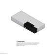
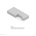
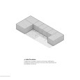
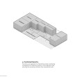
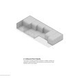
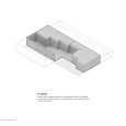
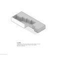
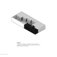
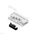
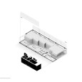
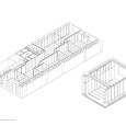
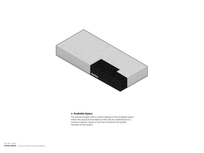
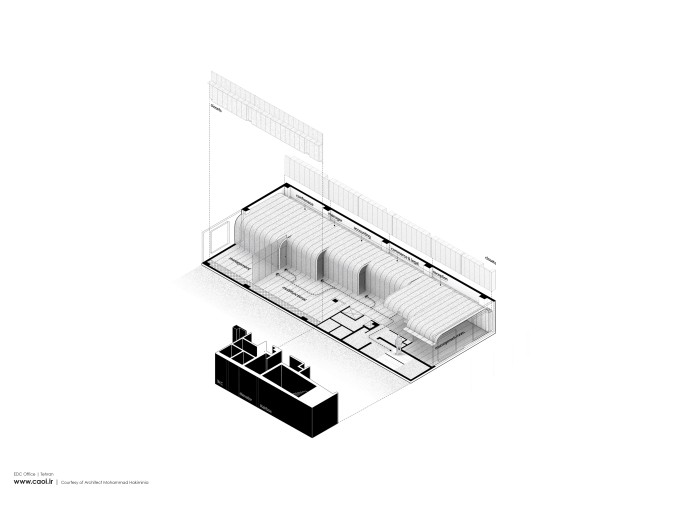
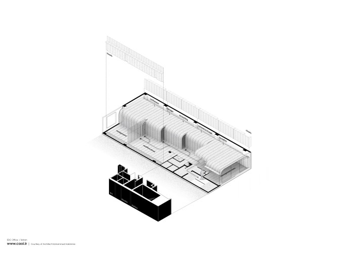
The project originated from a diagrammatic idea developed as a response to the spatial confusion and lack of hierarchy in the existing office prior to renovation. Rather than discarding the open office model, the design aimed to reorganize it—reducing its well-known drawbacks while preserving the openness and collaborative potential that give the typology value. This diagram became both a problem-solving tool and an expression of our architectural aesthetic, transforming functional requirements into a coherent spatial system.
- Site, Client, and Constraints
| Site
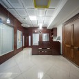
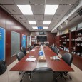
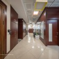
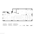
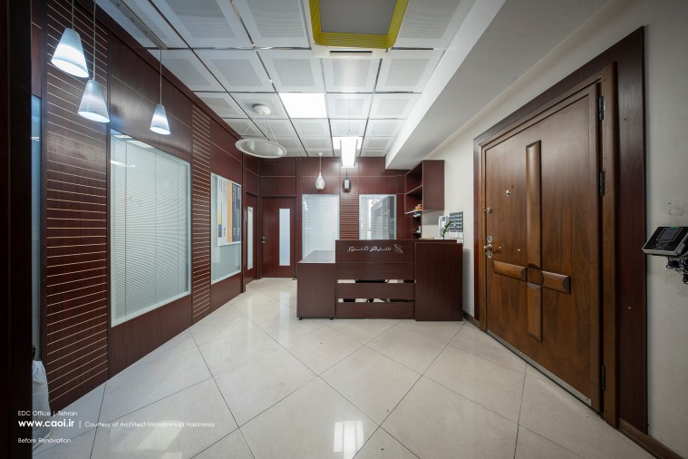
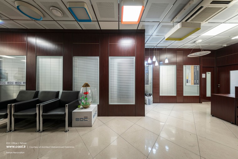
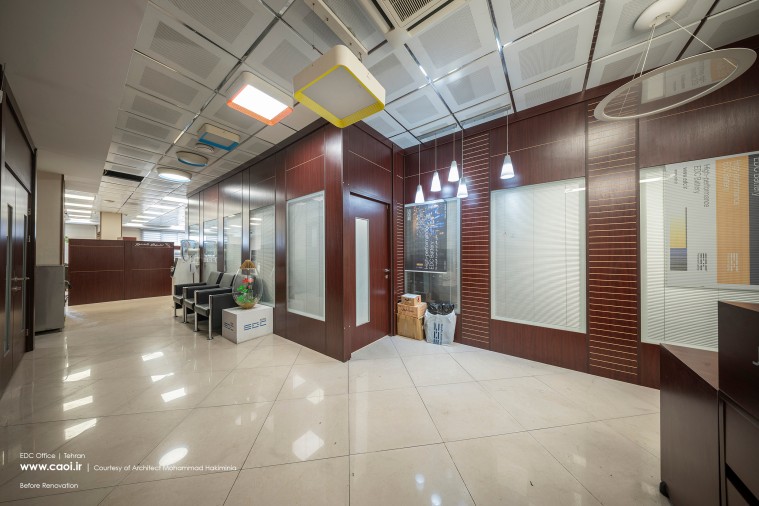
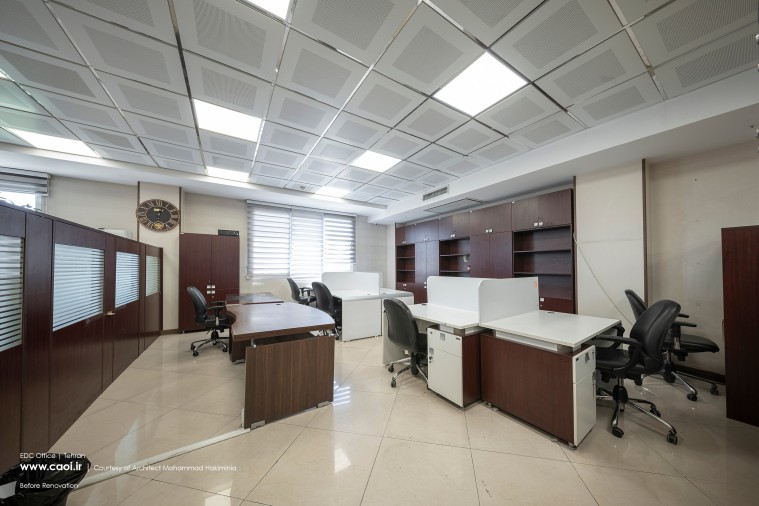
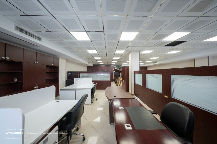
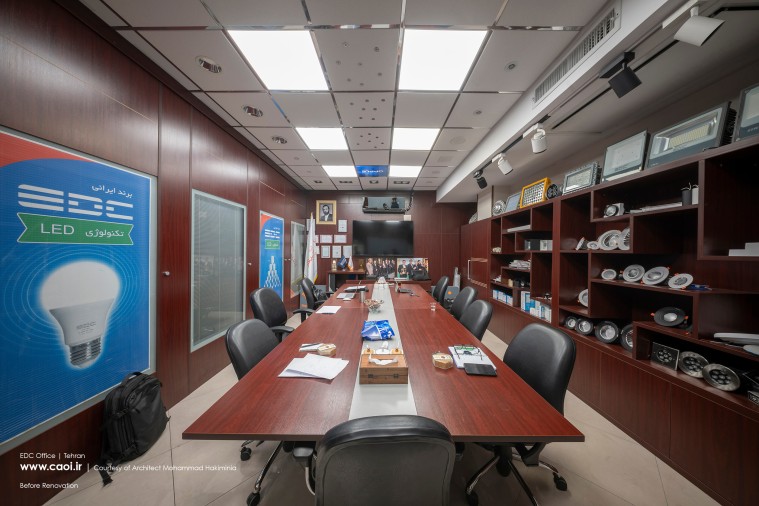
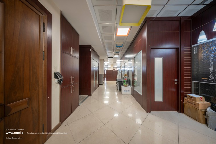
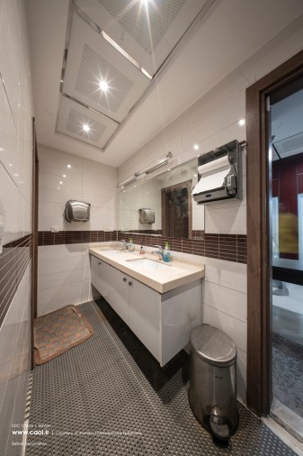
The project involved the renovation of a typical urban office that previously suffered from visual clutter, scattered partitions, and unclear circulation. The space lacked orientation and spatial identity, making everyday tasks unnecessarily complex.
| Client Brief
The client requested a set of clearly defined physical spaces and a more modern spatial structure compared to their previous condition. Their priorities were functional clarity, better organization, and an updated architectural character.
| Constraints
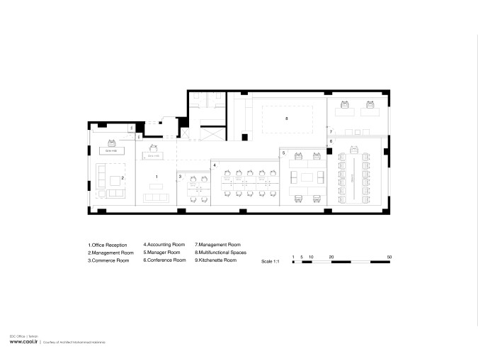
Challenges included working within the limits of the existing structure, reorganizing multiple functions within a compact footprint, and maintaining a clean visual field while integrating technical systems discreetly. Creating openness with readable boundaries was central to the problem.
- Design Concept and Solution
| Architectural Concept
The spatial strategy is defined by the interplay between:
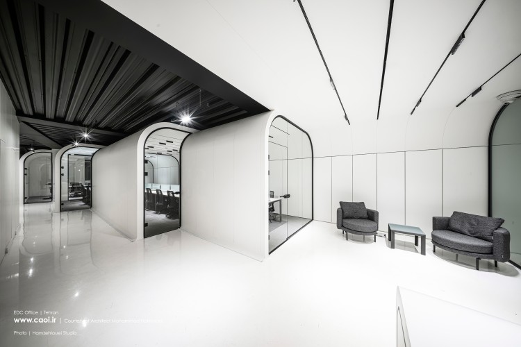
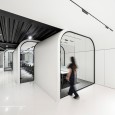
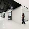
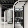
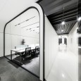
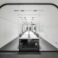
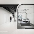
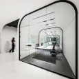
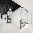
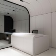
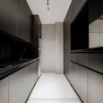
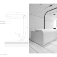
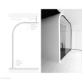
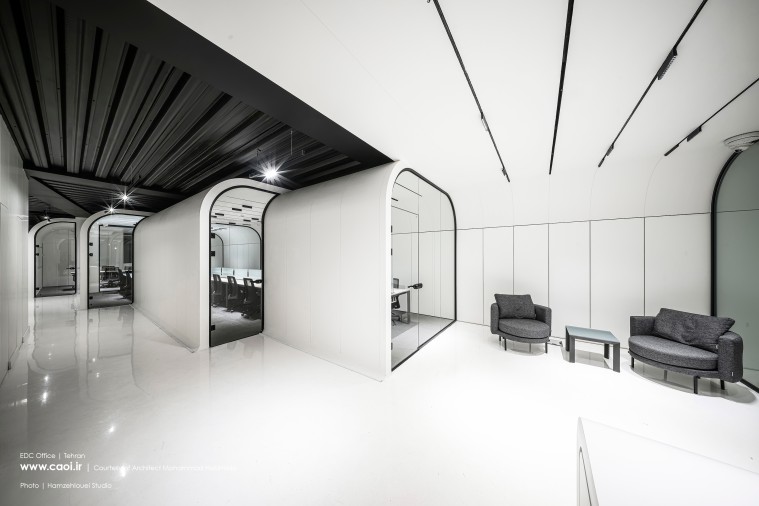
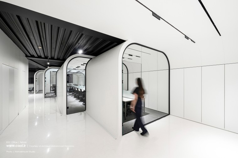
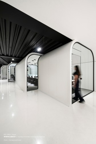
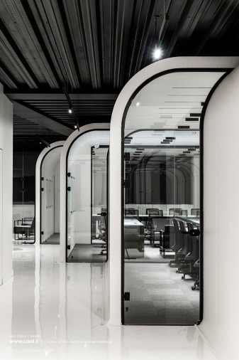
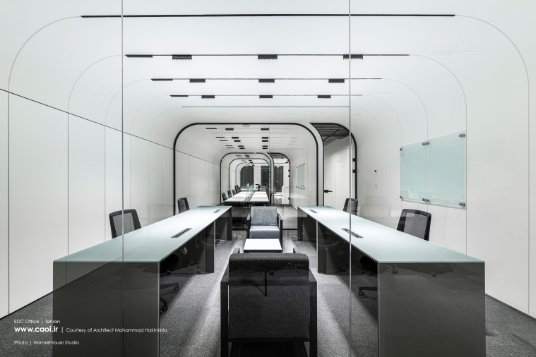
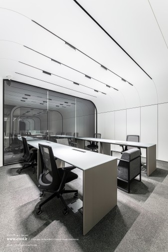
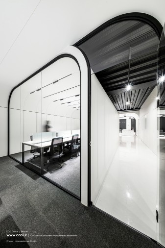
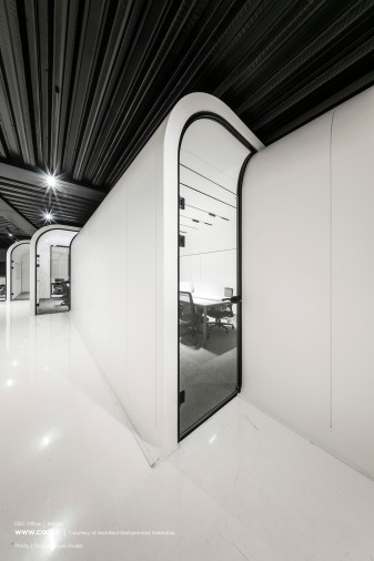
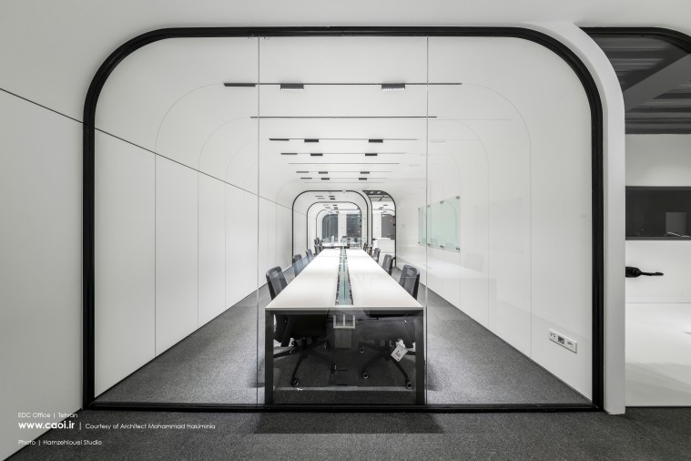
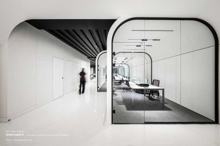
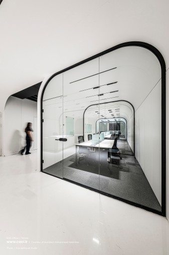
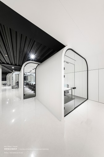
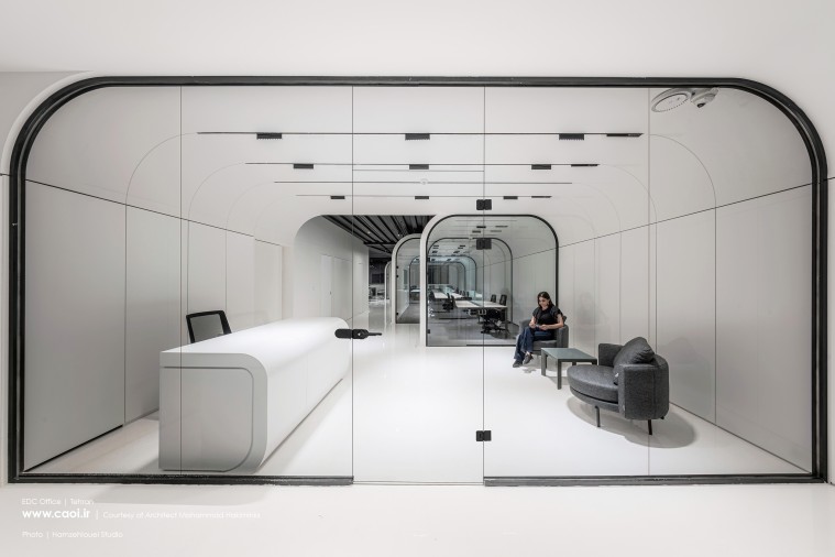
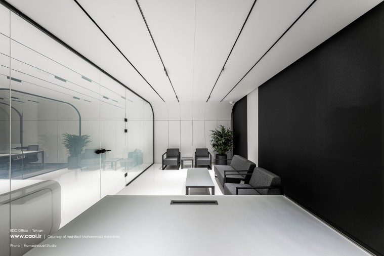
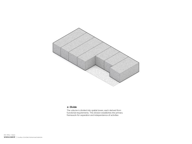
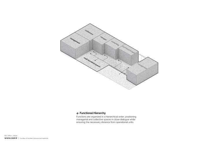
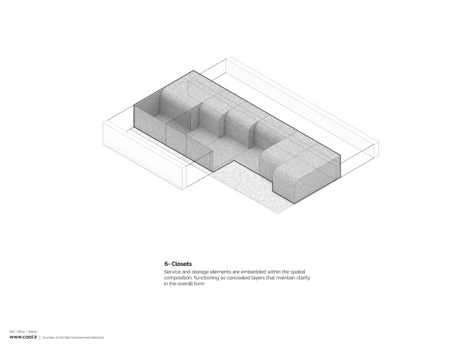
Independent programmatic boxes accommodating functions requiring privacy or control.
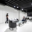
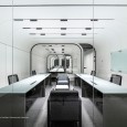
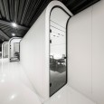
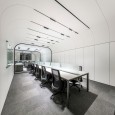
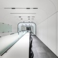
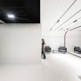
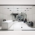
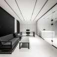
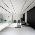
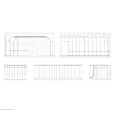
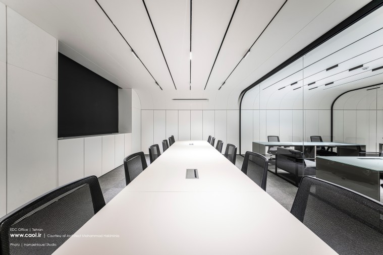
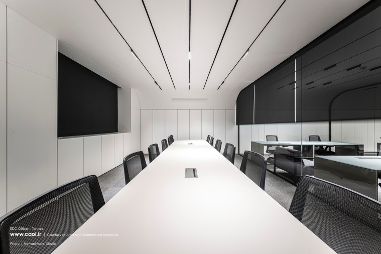
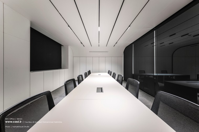
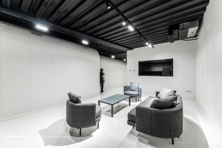
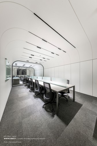
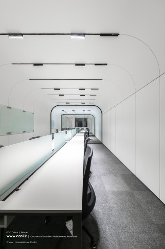
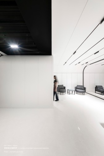
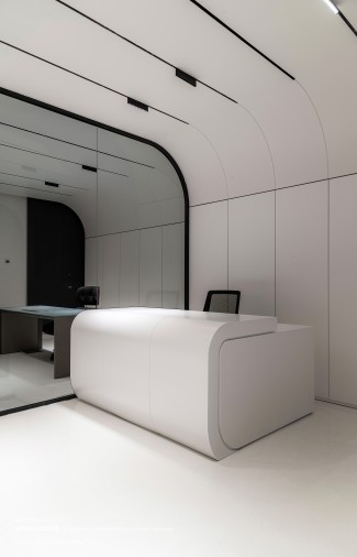
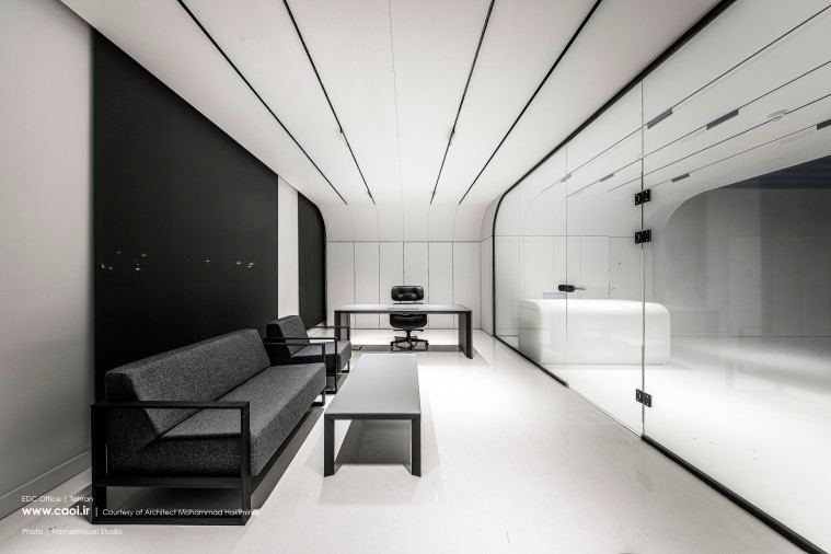
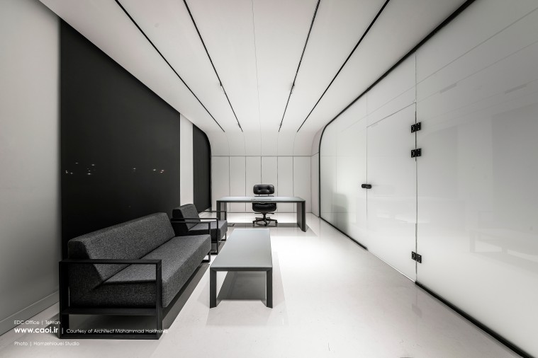
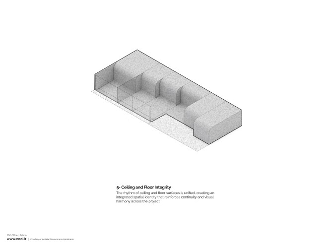
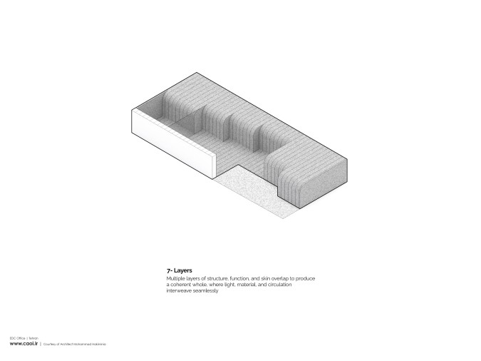
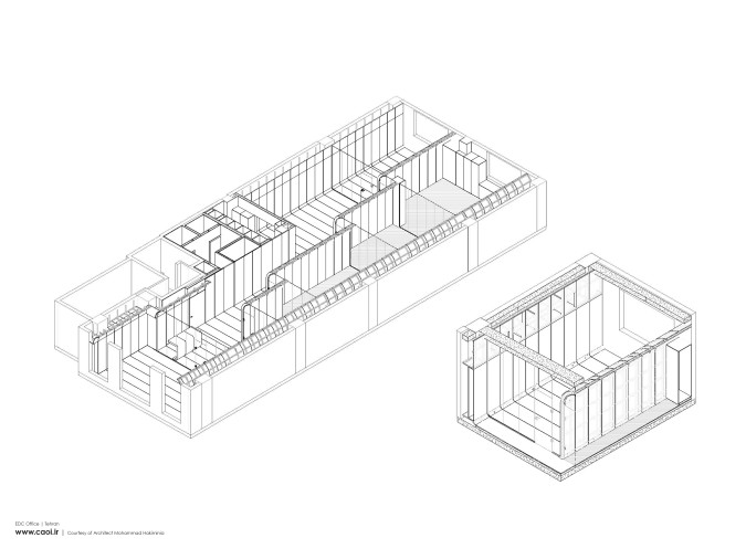
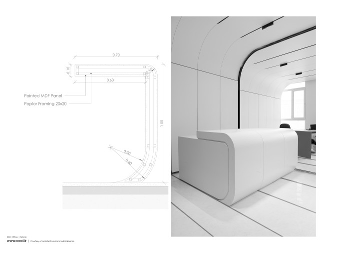
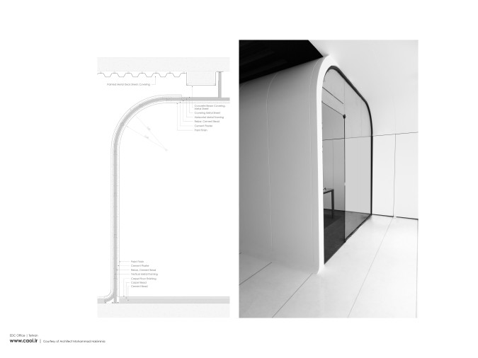
Continuous horizontal and vertical planes that unify floor, wall, and ceiling into a single field.
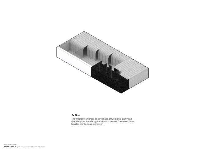
This combination creates a structured openness—an environment where collaboration and visual continuity coexist with moments of enclosure and hierarchy. The diagram served not just as a representation, but as the mechanism through which the issues of the previous layout were addressed in a way aligned with our aesthetic approach.
| Form and Function
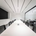
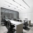
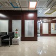
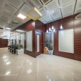
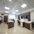
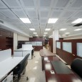
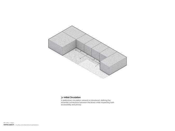
The boxes structure the program, while the continuous planes choreograph movement, sightlines, and transitions. Light and circulation flow seamlessly, producing a spatial rhythm that replaces the confusion of the former layout with clarity and coherence.
| Materials and Construction
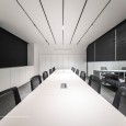
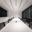
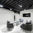
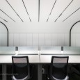
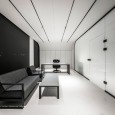
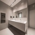
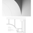
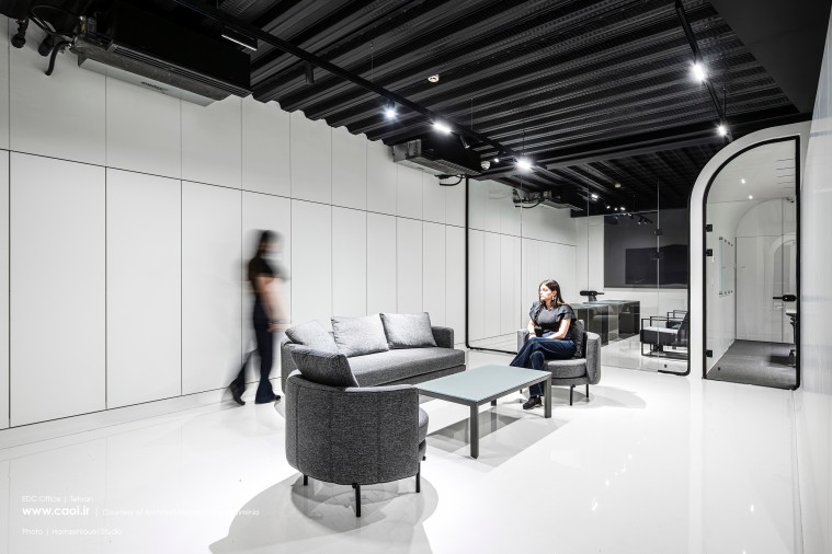
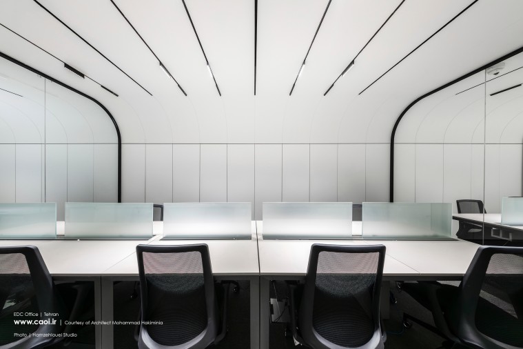
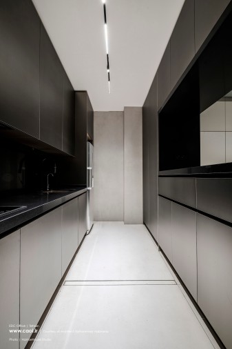
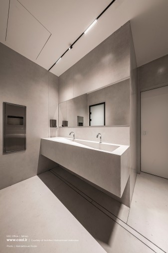
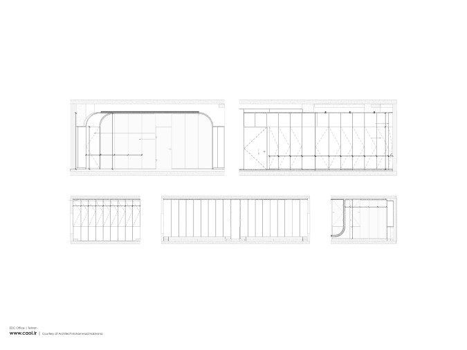
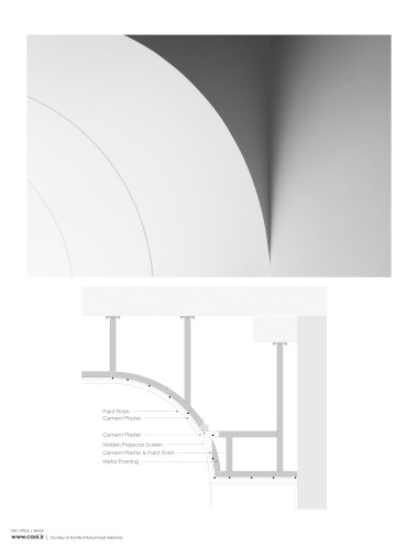
The renovation employed a minimal and unified material palette. The existing gypsum walls and ceiling and the epoxy floor were retained but transformed visually through a continuous layer of polyurethane paint applied across all surfaces—floor, walls, and ceiling. This coating merged disparate materials into a single uninterrupted field, reinforcing the conceptual emphasis on continuity and calm. Subtle linear textures on the white planes capture shifting daylight, adding tactile depth without visual noise. Technical systems were integrated within functional walls to maintain an uninterrupted architectural reading.
| User Experience
The resulting workspace feels both precise and sensorial. Order replaces the previous fragmentation, and a calm spatial atmosphere enhances orientation, focus, and comfort. Everyday work becomes an encounter with clarity, rhythm, and composed intensity.
- Impact and Conclusion
The project demonstrates how a simple diagrammatic idea can transform a problematic existing office into a coherent, meaningful spatial environment. By merging problem-solving with aesthetic intention, the renovation provides a workspace defined by clarity, continuity, and a refined spatial identity.